Not Sure Which Ribbons Go Together? Use One Color to Start
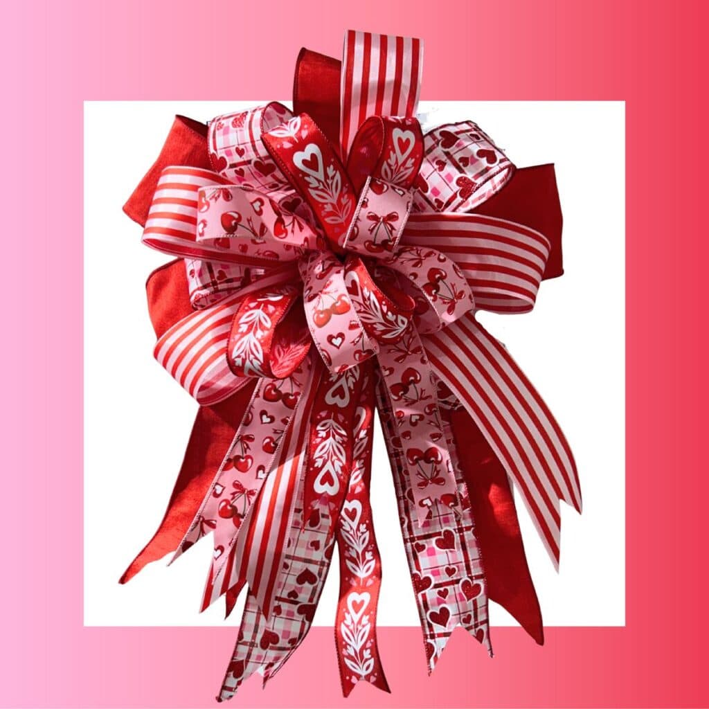
If you’re wondering how to choose ribbon for a bow, here’s an easy place to start: go with a monochromatic color theme. Picking ribbon can be tricky—there are so many patterns, textures, and shades that it’s hard to know what works together. But when you stick to one color family, it all comes together without the stress. You can still play with different patterns and materials, but everything feels cohesive and balanced.
What Is a Monochromatic Ribbon Theme?
A monochromatic color theme means using ribbons in different shades, tints, or tones of the same base color. For example, a bow made with light pink, blush, deep rose, and red still counts as monochromatic because they’re all part of the red color family. Even if the ribbons have different patterns or finishes—like velvet, satin, or plaid—they’ll still look cohesive when they stay within that one color group.
This idea comes from the color wheel, a great tool for seeing how colors relate. Monochromatic colors sit along the same slice of the wheel. If you want help finding shades that go together, Canva’s color palette generator is a fun way to play around with color families before pulling out your ribbon stash.
I’m no expert on the color wheel, and I’ve never had any formal design training—but I’ve found it to be a really helpful tool. It’s a great go-to when I’m not sure which colors work well together. Whether you’re looking for colors that compliment each other or ones that contrast in just the right way, the color wheel can take a lot of the guesswork out of ribbon picking. Use it as a starting point, not a rulebook—it’s just one more way to make bow-making a little easier.
Going Green: Monochromatic, with Personality
Here are two different versions with a green theme to show how easy it can be when you know how to choose ribbon for a bow. Both bows use a monochromatic color scheme, but the mix of textures and patterns gives each one its own personality. Whether you like something clean and simple or bold and playful, sticking to one color family makes the process a lot less overwhelming.

This bow is a great example of how a monochromatic ribbon design can look clean and coordinated without being boring. Everything here stays in the green family—from soft sage to olive and even a hint of metallic. The mix of florals, stripes, and leaf prints adds interest, while the solid green ribbons help ground the design. If you’re learning how to choose ribbon for a bow, this is a great approach to try: pick one color, then layer in a few patterns and textures to make it feel full and balanced.
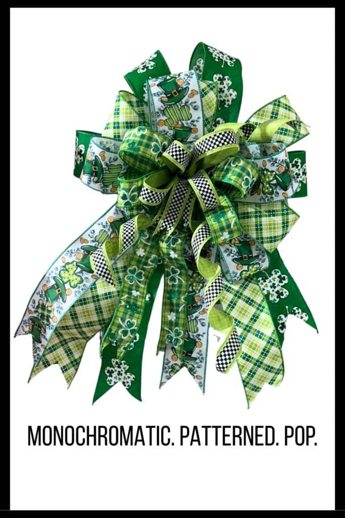
This St. Patrick’s Day bow sticks with the same green color family but takes a bolder approach with lots of playful patterns. Plaid, shamrocks, glitter, and leprechaun prints all work together because they’re grounded in one main color. What really makes this bow pop, though, are the touches of black and white. Even though black isn’t technically a color on the wheel, it adds a bold contrast that makes the green feel even more vibrant. It’s a great reminder that you can still stay within a monochromatic ribbon design while using a little contrast to add depth and personality.
Classic Red with a Bold Twist

This bow leans into rich, traditional red but elevates it with bold accents of black and gold. Even though the black adds strong contrast, it still complements the red base and helps it stand out. The gold edges add just the right amount of shine and warmth, giving the whole bow a timeless, almost regal feel. It’s still a monochromatic ribbon design at heart—everything centers around the red—but with layered textures and those dramatic accents, it really makes a statement.
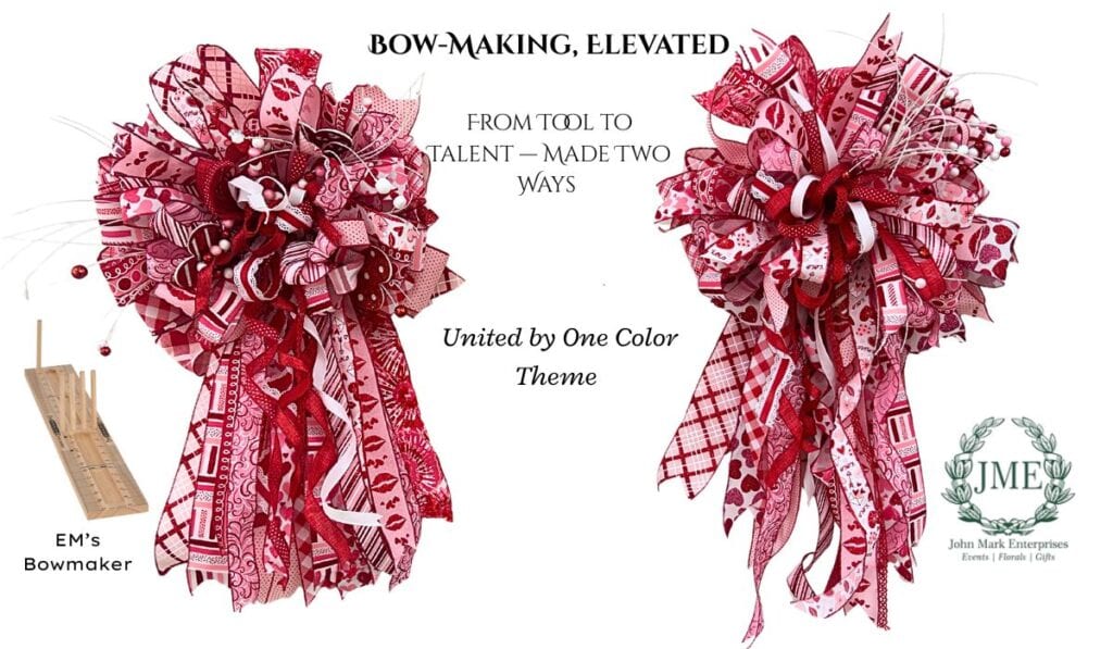
What Practice (and Ribbon!) Can Do
Final Thoughts: One Color Is a Great Place to Start
If you ever feel stuck picking ribbons, remember—you don’t have to use every color on the shelf. Starting with a monochromatic ribbon design keeps things simple, stylish, and stress-free. Whether you’re just learning how to choose ribbon for a bow or trying more advanced designs, one color family gives you plenty of room to play with texture, pattern, and personality.
Want to go beyond monochromatic? I’ve got more bows to share using color wheel combos like complementary, analogous, triadic, and tetradic color schemes. Let me know if you’d like to see them—or keep an eye out, because more ribbon inspiration is on the way!